Portal Design
Folks who read the RSS feed instead may want to pop over to have a look at the new Gateway redesign.
Thank you to all members who provided input for the new design exactly one month ago today.
There are many reasons for a redesign and I will go through some of them. The first reason is that attempting to design a top page to convert new visitors and also cater for current readers at the same time is not possible. The place ends up being a mess for both new visitors and current readers.
I've seen your feedback in the Puchi Blurbs - some of you love it, hate it and some of you even think its more messy than before! Well at least its not messy for the first time visitor too ^^;
Its difficult to please all and I will fail miserably if I set out to do so (Bill Cosby).
I spend much time working with other site owners to drive traffic to this site but if the first run experience sucks then conversion is going to be low. My task is to convert new visitors into regular users buy cutting out as much irrelevant information as possible. For example, I want new visitors to note the quality of the articles - figure releases before they are announced, Japanese office tours, life in Japan etc. But New visitors don't necessarily need to know about the member articles or puchi blurbs as soon as they arrive - they can get to that later if they decide to stay on.
On the other hand, I need to make sure that regular visitors don't see the marketing blurbs or elements that clutter up the experience even more. Many blogs in particular are stuffed with so much stuff in the side columns that users get desensitized to those areas and completely ignore them.
This is the first iteration of the design and I will be making changes based on user behavior. I want to make the Gateway for regular users more configurable.
Another site where you will see constant changes to the layout based on user behavior is iknow.co.jp - keep your eye on it if you are into the usability thing too.
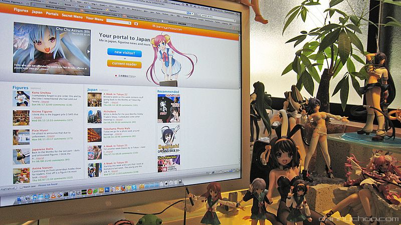
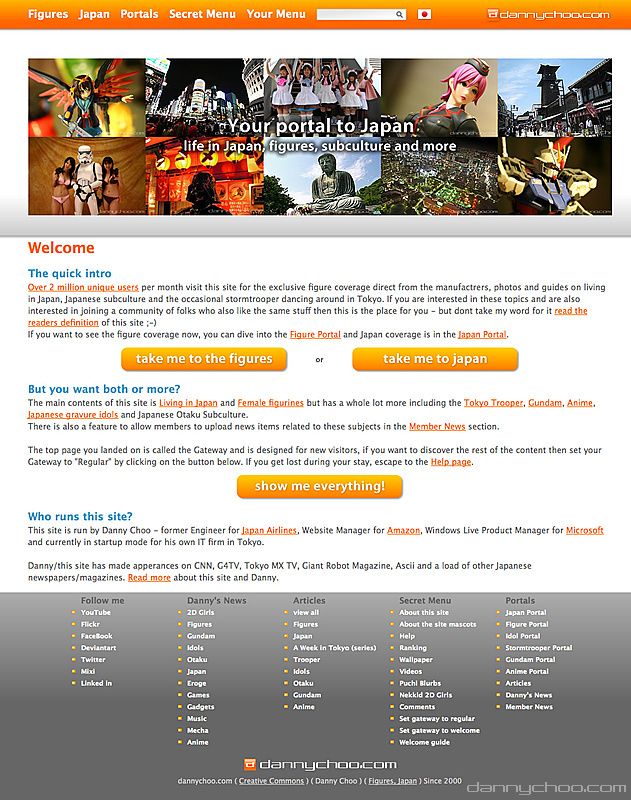
Below is what you will see the first time you arrive. Its basically whats known in the web industry as a Landing Page. Here I have only 3-7 seconds to convince the user to explore more.
With help from your definition of DC Com, The catch phrase I use sums up what the site is about - "Your portal to Japan."
With help from your definition of DC Com, The catch phrase I use sums up what the site is about - "Your portal to Japan."
The slides show strong articles from the Japan and Figure categories.
Below the top band are figure articles on the left and Japan articles in the center. The bottom of the center column is blurb to let folks know what this site about and who runs it.
Below the top band are figure articles on the left and Japan articles in the center. The bottom of the center column is blurb to let folks know what this site about and who runs it.
This is a similar approach to what first time users see at Flickr. The first time user will see a photo with a simple blurb. Users who are logged in see something completely different - items which they care about.
First time visitors click on the "New Visitor?" button and arrive in the welcome page where I give them the nitty gritty about the site. People who have already clicked through to this page show some interest and will invest more time to read but I still need to keep the blurb short.
From here, users jump into the Figure or Japan portal or dive straight in to see what regular users see by setting their Gateway to show content for regular users.
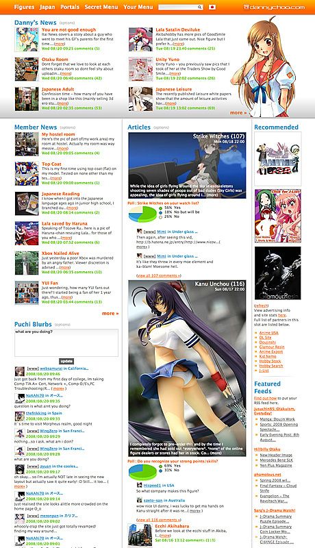
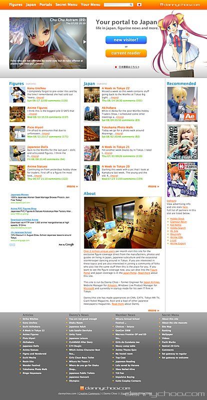
Below is the regular user Gateway. The only main difference is the header bit. The loading time for the previous thumbnailed header is now used more efficiently for my news items instead. They are updated more frequently than Articles so I thought it would make more sense to stick them at the top.
Member news has been extended to 6 items. I'm quietly pleased with the images for articles. The original designs had a black band with transparency at the top and bottom for the text - quite common on many web2.0 designs these days. The black band looked quite bad and tried out a gradient instead - really liked the look of it ^^;
For those who are into CSS, just make two PNG gradients and span the background across two divs - one at the top and one at the bottom of another div which holds the image. If you want this to work in ie6, you will need to use something like jQuery ifixpng.
After launching the portals and studying user behavior, I realized that portals are not really used by regular readers. Most regular readers want to catch most of the content which is why they hit the top Gateway instead.
Thus I have made the portals into Landing Page type designs - still needs improving though.
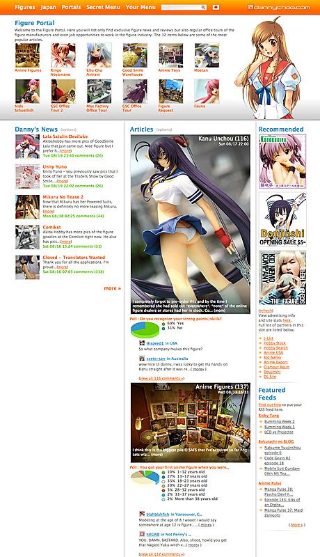
The top band shows the most popular articles and gives the new user a taster of the goodies inside. This is the Figure Portal
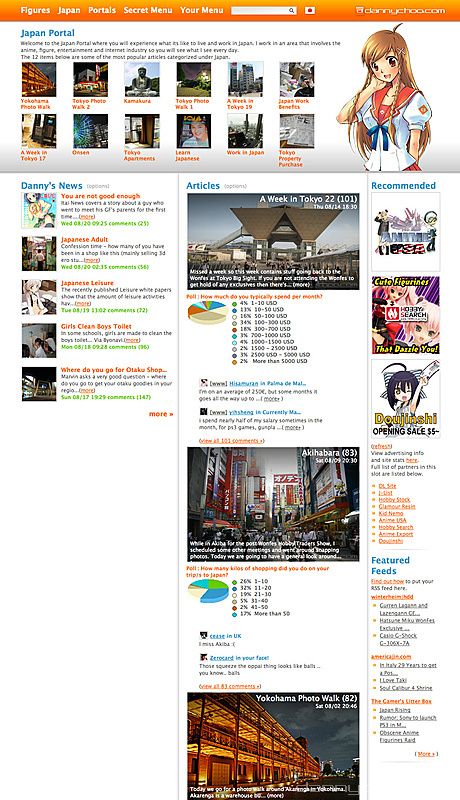
The Japan portal is the same - popular articles at the top and arranged in a way to convince new visitors to stay on.
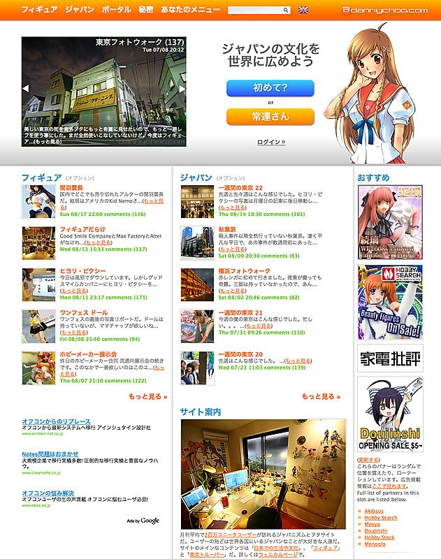
And this is the Japanese Gateway for the first time user.
There is still much work to do around the site and will be migrating to the new design step by step starting with my profile page, detail pages for articles and News Items and then onto pagination pages and gallery slides etc.
There is still much work to do around the site and will be migrating to the new design step by step starting with my profile page, detail pages for articles and News Items and then onto pagination pages and gallery slides etc.
Items on my immediate to-do list are add more images of Haruka and Mirai to the header rotation pool and display categories for News Items.
Adsense users will know that Google dropped the referral program. As a result, I got mail from them asking me to end the Google DC Rewards - this is another reason for the redesign as I needed to remove a bunch of code. The DCReward feed should be replaced with the standard feed that you have registered on your site. I still want you to make money and will be announcing another way for you to easily do so soon.
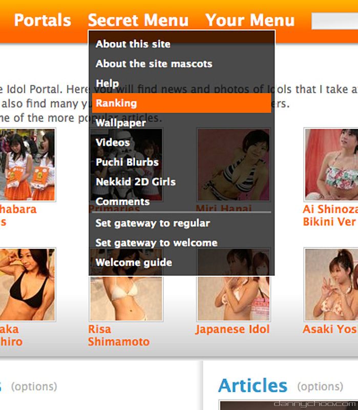
All items that were available in the previous header menu are available in the new orange band. The Secret Menu contains a way for you to reset your browser cookies so that you can see what I am up to in terms of trying to convert new users.
The Secret Menu also contains a new section called Nekkid 2D girls for the 2D girl fan (aren't we all?)
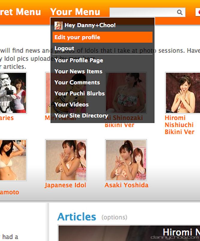
From now on I will put all items in Your Menu. If you are not logged in then you wont see this.
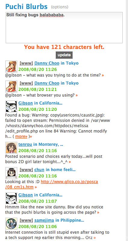
A form is now above the Puchi Blurbs and includes a counter. Any URL you enter is enabled with snapshots too. let us know what you are looking at, any interesting discoveries etc. The next step is to integrate into twitter too.
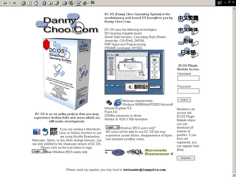
And just to recap from the history of dannychoo.com article where you will see more - this is what the website looked like back in the year 2000.
Changes for the better are good. Its like introducing a new work flow into your life - can be difficult to get accustomed to at first but will be beneficial in the long run - until its time for other changes for the better. And thus the cycle continues. Embracing change is good - its the only way forward.
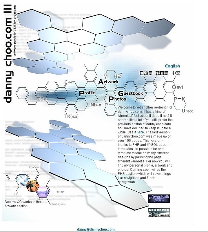
This is what dannychoo.com looked like in 2002.
Through each design iteration, I've always been analyzing user behavior so that I can add/remove/change what was necessary to improve the user experience. At Amazon, we had internal tools that enabled us to set up intricate tests to see what users clicked on etc. Now Google offers Google Web Optimizer. Its a new tool that enables you to try out different designs of your website. Google will show different layouts to different visitors of the same page. Google will also handle the sessions involved. The tool will generate a report to show you which design was the most effective in converting your users. The video below explains more about Web Optimizer.
Through each design iteration, I've always been analyzing user behavior so that I can add/remove/change what was necessary to improve the user experience. At Amazon, we had internal tools that enabled us to set up intricate tests to see what users clicked on etc. Now Google offers Google Web Optimizer. Its a new tool that enables you to try out different designs of your website. Google will show different layouts to different visitors of the same page. Google will also handle the sessions involved. The tool will generate a report to show you which design was the most effective in converting your users. The video below explains more about Web Optimizer.
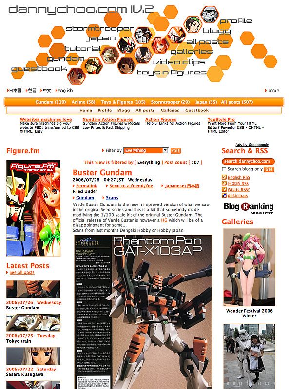
The hexagonal theme continues with this orange look n feel in 2006.
I will be using Google Web Optimizer to test out different messages/graphics/layout on the first time user Gateway and use those results to increase conversion of first time visitors.
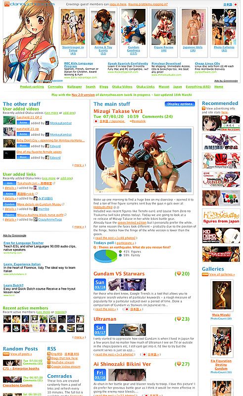
And this is what the site looked like just over a year ago. Time certainly flies.
Ah, nearly forgot to mention that some layout and navigational features have been left out of IE6 and IE7 - Both browsers contain too many CSS bugs. Firefox and Safari work well but iPod Touch/iPhone look a bit odd.
Folks who have wide screens will enjoy both of Haruka-chans twin tails ^^;
Let me know if you have any issues viewing the site and state your browser and OS type.
And thanks to all members who have been helping me fix bugs in the Puchi Blurbs ^^