OK, have given this very deep thought indeed based on feedback from new users.
One of the main deciding factors for new users to stay on is the original photo articles. While news on figure releases and other non-photo based news items are important - they don't have as much weight as articles do in terms of quality and depth.
20090320 Top Redesign Progress
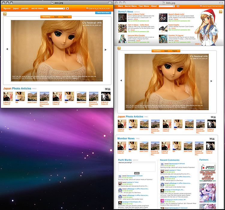
For this reason, the first time user will be presented with the top page being articles only (aaa.jpg on the left) based on what they click on the welcome gateway. If they choose "Japan", they will be sent to the top page already configured with Japan only articles and not see the figures which do not interest them. They can alternatively choose "Figures" or "Everything."
This strategy means that new users are presented with the "beef" of the site being the in depth articles.
Without the other stuff on the top page, new users hopefully wont get as confused as before.
Lately, I seem to have become recognized as a photographer (even though I still cant use the SLR properly) which was one of the reasons why I was chosen for the Commercial shoot today ^^ Because of this, I want my photo articles to be the main deciding factor for new users to stay on - again, this is one of the main reasons why many previous users have decided to stay on.
After new users get used to the site, they can click on the blue tab peeking out the main nav at the top of the screen to show my News Items which will be initially filtered with items that contain photos that I've taken - there will be options to show everything.
There will then be a button somewhere allowing new users to "Show Community Features" which will turn on the Puchi Blurbs, Latest Comments and Member News on the top page as you can see in bbb.jpg in the right of the screenshot.
The thumbnails are initially displayed in Grid mode but you can flip to List mode if you want.
The thumbnails are initially displayed in Grid mode but you can flip to List mode if you want.
I also realize that regular users may not necessarily want a single huge photo taking up the top page for a few days too - which is why there will be an option to fold it somehow - still thinking about the technical implementation. The arrows at the left and right of the photo will allow users to flip through to the next/previous post. But would be interested to know whether you mind the huge image staying put for a few days or not.
As with all the previous designs which have been based on your feedback, I wanted to show this to you before rolling it out. I believe that these changes will help increase conversion of new visitors to the site while catering for regular users too.
These are pretty radical changes - important changes for the better. The current design has a limit to how many new visitors can be converted as there is still too much info on the top page for the new user to digest. All the things you are used to seeing should still be on the top page - just in a different spot. Need your feedback on the proposal and want to make sure changes don't inconvenience your browsing experience at DC.